

HEXHAD

Brand guidelines

Logo
HEXHAD
01
Construction: every cut at 30°
02
App icon and favicon
HEXHAD app icon512
180
32
16
03
Tagline

Tools for people who ship apps.

04
Colour
Cell Mint#43E0A0
700 #0A7A52 for small text on light
Graphite 950#0A0B0D
Graphite 800#1A1D21
Graphite 50#F4F5F6
Graphite 400#9BA1A8
05
Typography
Aa Geist
ABCDEFGHIJKLMNOPQRSTUVWXYZ 0123456789
Geist Mono: npm i @hexhad/react-utils
06
Product family
NotchPal
NotchPal Android
BarQR
Droid Transfer
MirrorMe

Morse Code
Splice

DiskKeeper

Wasthu
07
Pattern: the hex cell field
08
Interface
Get in touchGitHub
$ npm i @hexhad/react-native-global-modal
AndroidiOSmacOSWindows
09

The idea

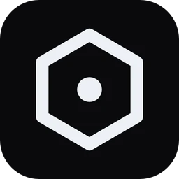
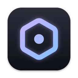
A hexagon is a cell: complete on its own, and built to fit next to others. Each HEXHAD product does one job and sits beside the rest. The H inside dips at 30°, so every cut in the mark runs parallel to an edge of the hexagon.

Using the mark

  • Keep clear space equal to the width of one H stroke on every side.
  • Smallest size: 16 px with the favicon, 20 px for the outline mark.
  • One colour only: Graphite 50 on dark, Graphite 950 on light, or Cell Mint on Graphite.
  • Don't rotate, outline, add shadows to or recolour the H separately from the hexagon.

Colour and type

  • Cell Mint is the only accent. Use it for one action and one highlight per view.
  • Mint fills always carry Graphite 950 text (#04130C).
  • Geist 650 for headlines with tight tracking, Geist 400 for body, Geist Mono for code and metadata.
  • Wordmark: HEXHAD in Geist Bold, uppercase, 0.14em tracking.